There’s not denying that flat design is the big thing in design these days.
It’s everywhere. And not just flat design, but now with almost flat design as well.
The arguments about the validity and application of the style are raging. The super-trendy design style elicits an opinion from almost everyone. So let’s take a step back and look at both sides of the issue and some pros and cons of flat design.
Pro: Flat Design is Trendy
Flat design is very trendy , but how long will it last?
If you are an on-trend designer this is the time to jump on the flat design ship if you have not already. Projects using the style – and using it well – are getting a ton of recognition from blogs, including this one, that can help you promote your design....
And it’s a lot of fun to design with the times.
Con: It’s Trendy
On the flip side of the trend equation is that you never know how long a trend will last.
Already we are beginning to see more of a move from purely flat design to almost flat design or flat design using long shadows.
If you reinvent your website or app frequently, trendy design may be for you. If you want a website that has a long shelf life, consider something a little less “in the moment.”
Pro: Simple Mobile Interface
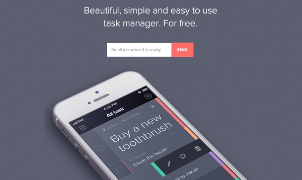
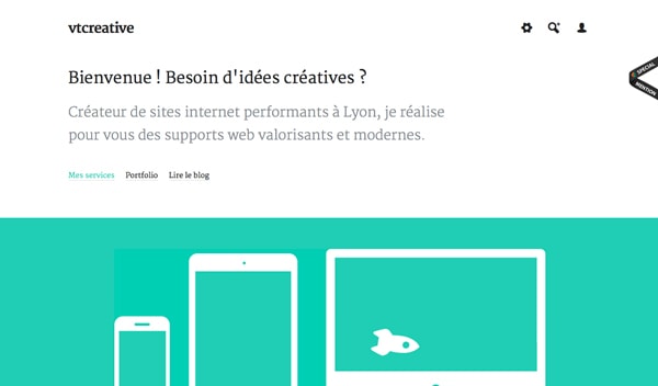
One of the best applications for flat design really is in simple mobile design.
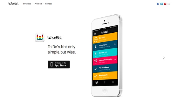
Some of the most impressive flat interfaces and designs are for mobile apps that function simply. Big bold buttons are east to tap on mobile devices, eliminating the need for zooming to find links.
Con: Usability Concerns
When it comes to more complex user experiences, flat design can sometimes, well, fall flat.
Not all users are comfortable with the style of interface and don’t always know what and were to click or tap.
An analysis by the Norman Nielsen Group found that flat design styles can hinder usability because users don’t always know what is clickable. Further, flat design projects tend to include less “information density” in an effort to keep it simple.
Pro: Bright Color Sets a Mood
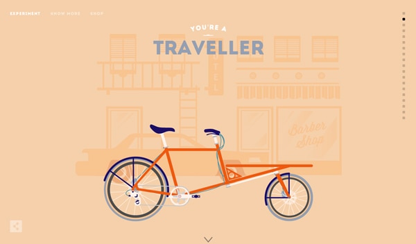
Maybe it’s just me but flat design just seems happy. All the bright, bold color is engaging and sets a tone of engagement and positivity.
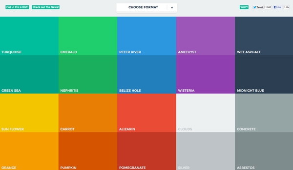
Flat UI Colors, a website designed to showcase and help designers create and use flat colors, is a great mood-booster.
Take a look at the hues, they are all warm and inviting. Even the darker colors are based in warmer tones.
Because flat design often includes a lot of color, that increases the positive associations. Who ever looked at a rainbow and called it sad?
Con: Color Palettes Can be Tough to Match
The more colors you use in a project, the tougher it can be to match them properly.
Creating a harmonious color palette is a challenge on its own, and can be even more challenging when you add four, five or more colors. Designers who create the most successful flat color palettes tend to stick to a uniform look in terms of saturation and brightness so color choices look intentional.
Pro: Focus on Great Typography
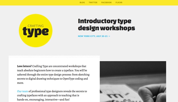
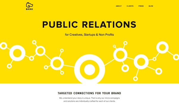
One of the great things about flat design is the true focus on beautiful type.
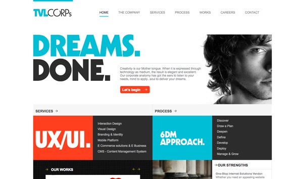
With no decoration, typography really has blossomed in flat design projects. From beautiful decorative lettering to simple sans serifs, great type is one of the key components to a great flat design outline.
And personally, drop shadows on type kind of ruin great lettering. The sharp contrast between interesting typefaces and bold color is impressive and refreshing.
Con: Weak Typography Becomes More Obvious
Just as flat design helps create a focus on good typography, it can really make bad typography stand out as well. (Just look at all the flack Apple received after previewing iOS 7 with an ultra-thin primary typeface, a design decision that has since been revised.)
Flat design is very unforgiving when it comes to boldness. Every choice has some degree of drama, making it hard to hide less-than-ideal typography.
If you are not comfortable pairing or selecting fonts, flat design may not be the best option for you.
Pro: Visuals are Sharp and Clean
The nature of flat design is sharp and clean. That’s one of the features that makes it beautiful.
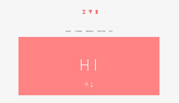
The style uses a lot of high-contrast features including color, type and an overall boldness that make lines clean and easy to follow. Buttons and other user interface elements are often design using basic geometric shapes with shapes, although basic rounding may also be used for some corners or edges.
Con: It Can Look Too Simple
Depending on the use, flat design has been called “too simple” by some.
It can be difficult to convey a complicated visual message in flat design.
The other argument against flat design is the simplicity of user-interface tools. Proponents of skeuomorphic design say embellishments that add a sense of realism make tools easy to use. Frankly, it depends on the context.
Visual hierarchy can also be a concern with super-simple interface designs. What is most important? How do you emphasis it visually?
Pro: Flat Design Discourages Boredom Decoration
There’s nothing worse than looking at a design and knowing the designer was bored with the project.
The tell-tale signs include too many shadows, odd animations or just a smattering of random effects that don’t seem to have a place.
Because of the simple nature of flat design, constraints help keep designers “honest” if they want to complete a project in the true nature of the style.
Con: Some Decoration Can be Good
Not all decoration is bad.
Flat design truly limits the number of tricks you can use if you want the project to be truly flat.
Conclusion
No design outlines is perfect. Tailor your design for each project so that the look matches the feel and tone of the message.
Design is about more than how something looks. It is also about usability and function. Good design is easy to use.
Are there pros and cons to flat design not mentioned here? Discuss in the comments.



No comments:
Post a Comment